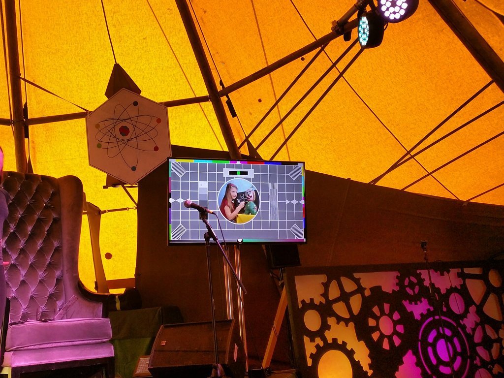
I do a lot of talks and presentations - sometimes in boring conference centres, sometimes in pubs, and occasionally in the middle of a field. One of the things that I've learned is the audio-visual equipment is unreliable. The colours can be off, the projection can be blocked by detritus on stage, or the screen can be defective.
It's never a fun experience to flip to your first slide and realise that something is profoundly wrong with the picture. That's why all my presentation decks now start with a Test Card slide.
Here it is in action at the Shambala Festival (the aforementioned tent).

You can download my high quality testcard from GitHub.
I'm fussy when it comes to the way I present. I don't want the audience distracted by a flickering screen or inverted colours. A test card is the ideal way to see if the visual equipment is working.
Ideally, I test this before the start of the conference - that gives everyone enough time to make sure settings are adjusted and stages are cleared. But if I can't do that - the test card has the advantage of being easily ignorable. People glance at it, realise it isn't related to the presentation and then look away.
Other Top Tips
These go equally for conference organisers as well as presenters.
- What screen ratio and resolution will you be using? High Definition widescreen slides look crappy when squashed into a 4:3 low resolution projection. Know this before you create the slides.
- You need high contrast between your background and your text. I prefer green text on a black background.
- Remember the people at the back of the audience. BIG BOLD FONTS!
- All presenters should present from the same laptop. No one wants to see you spend 5 minutes trying to get your laptop working with a projector.
- Oh, and finally...


What links here from around this blog?