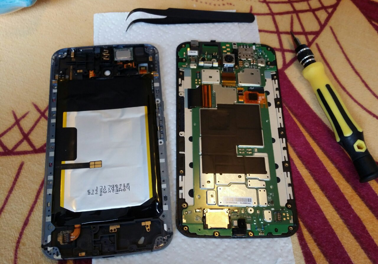
Last year, the battery on my Motorola Nexus 6 died. It got hot enough to melt the glue holding the phone together and started bulging - so I replaced it.
Now, sadly, the new battery has failed. The phone will suddenly switch off as though the battery were yanked out. After a few minutes it will happily turn on again. Most frustrating.
Rather than go to the expense of replacing the entire handset, or trying my luck with a different battery, I decided to try a £18 extended battery case.

The case is large and adds a bit of heft to an already plus-sized phablet. It has a fairly grippy rubberised plastic coating which makes it pleasant to hold, and unlikely to slip away from you.
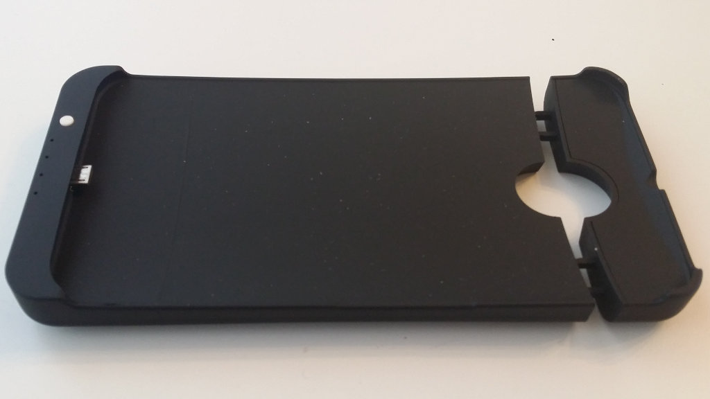 There's a single button which is used to activate the charger.
Once the phone is clipped in, it begins to charge immediately. The four LEDs at the bottom give you an indication of how full the battery is.
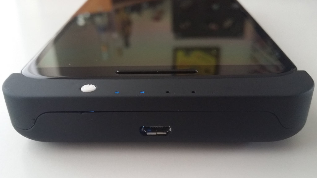 The LEDs are ridiculously bright - it's unpleasant using the case in a dark environment. A small bit of black tape sorts out the problem.
The cut outs are well placed and don't interfere with the headphone jack. Similarly the power and volume buttons are easy to access.
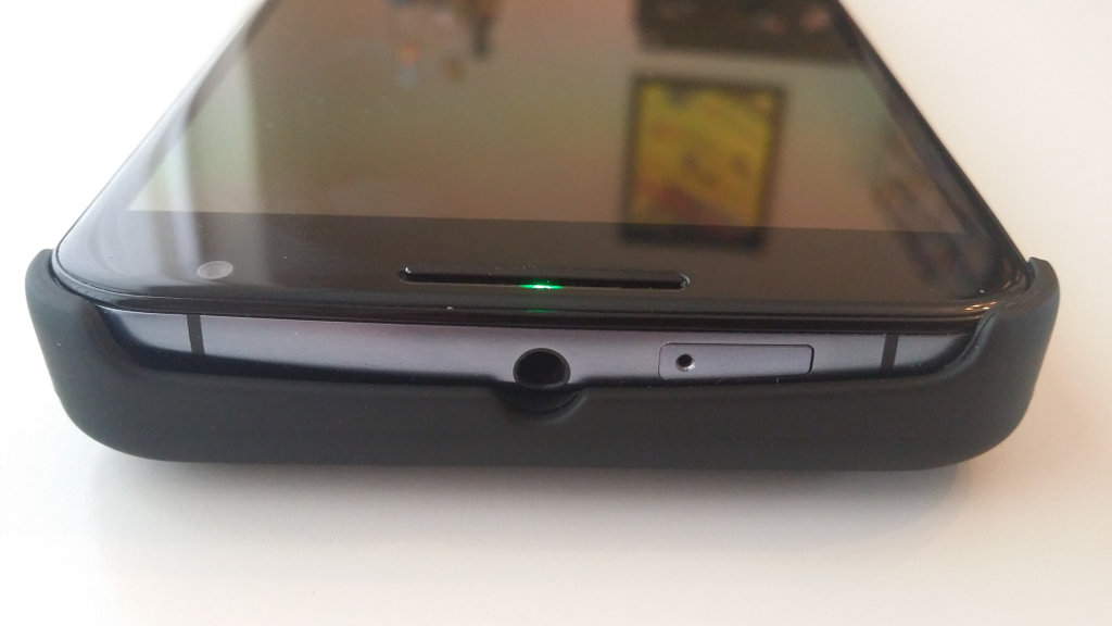 As you can see, the phone doesn't quite sit flush into the case. There really ought to be a way to tighten down the top.
It's a chunky beast - but the 4,200 mAh battery demands that size.
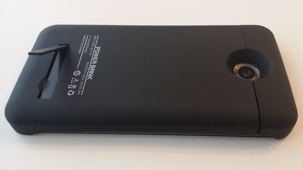
There's a recessed kick stand which, while feeling slightly flimsy, holds up the phablet at the perfect angle for watching movies.
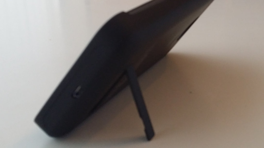
The case doesn't quite snap shut fully - and there's no locking mechanism. This means the top is prone to shifting open.

The camera is quite recessed - but it doesn't seem to reduce the photo quality.
Overall, it works well. Depending on how you use the phone, this will dramatically increase your "screen-on-time". If you have the pocket space, I recommend it.
Downsides
It's good - and a great price - but it's not perfect.
- The maximum power output is 0.8 Amps. This isn't a fast charger, but it's good enough to trickle power into your battery throughout the day.
- Because Android sees it as a charger, your phone may not go into deep sleep.
- It charges itself at around 1 Amp - so expect it to take a few hours to fill up from empty.
- Like all cheap chargers, it buzzes a little when in use. Sounds like an old fashioned hard-drive chittering away!
- There is a design flaw on the N6 which makes the touch-screen slightly erratic when charging. It also produces a faint buzz in attached headphones. This occurs whether using a stock charger or this battery pack.
- The case is a little loose at the top. It doesn't feel like it's going to pop off and release the phone, but it's not reassuringly snug.
- Blue LEDs are too bright.
- No Qi built in. The case is too thick to let the phone's built-in wireless charger to pick up the power.
- Upside-down USB port. Can't really fault the manufacturer for this - but Motorola's bone-headed decision to invert the port continues to annoy.
- Even for someone with fairly large hands, the size and weight takes getting used to.
If you've got a dodgy battery and don't want to disassemble the phone - or if you want to get through a whole day of use - I can recommend the £18 Moonmini extended battery case.
Thoughts on Mobile Battery Life
4 years ago, I tried a similar battery case for the original Samsung Galaxy.

It strikes me that not much has changed in the world of Android. I struggle to actually use the phone for more than a few hours each day before the battery dies. Fat battery packs double the life at the "expense" of portability.
Don't get me wrong, Android is becoming more efficient - it can push more pixels and transfer more data on battery packs which are barely bigger that when it was first released. The HTC Magic was released 6 years ago and had a 1,340mAh battery - the latest Nexus 6P has a 3,450mAh battery.
The state of the art is 2.5 times the battery power, but still barely a day of real use.
While Moore's Law still holds, we can expect a doubling of processing power ever 18 months - sadly battery technology just hasn't kept pace. While Marshmallow's "doze mode" helps, perhaps it's time for Android to concentrate on efficiency rather than "beautiful" animations?
