I can only assume that on their first day at Google, new employees are given their Android phone, a ChromeBook, a self-driving car, and complementary Laser Eye Surgery. That's my theory on some of the problems besetting Android's Lollipop release.
I've ranted about Lollipop before, and now I'd like to point out two particular problems.
All of these tests were performed on a Nexus 4 running Android 5.0.1, and the most recent versions of the apps.
Word Wrap
I've spent two years moaning about how Google ignores its public bug tracker. One bug which keeps raising its head is that Google's default web browser doesn't wrap text when zoomed in.
Let me show you what I mean. On the left is Google Chrome. On the right is Opera. I've tried to scale the images so they're roughly the same as their physical size. When opening a non-mobile page, I can double tap to zoom into the text.

That's not easily readable for me. My eyesight is pretty good, but reading text at that size is simply not comfortable for long periods of time. I can move the phone closer to my eyes, but that's also quite uncomfortable.
Ok, so let's use Apple's patented "Pinch To Zoom" method and bump up that font size.
Ah.
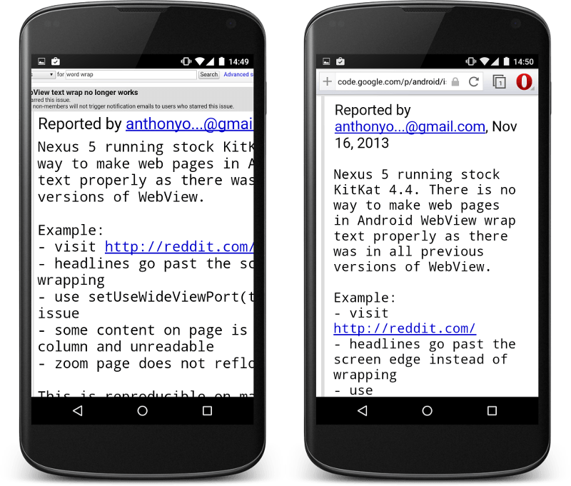 So, the font size is readable, but using Chrome I have to pan left & right in order to read the page. With Opera, the text wraps perfectly and I only need to scroll vertically.
Horizontal scrolling of text is an awful user experience; it's slow and error prone. It's fatiguing to read, problematic for many people with visual impairments, and can interfere with other horizontal gestures that a page or app may have. (NB - mobile users are quite used to horizontal swiping as a form of navigation - but for reading large swathes of text, it's not very pleasant.)
Opera gets it right. It wraps the text to the viewport. This is, it has to be said, an opt-in setting. It's off by default.

Opera places virtually no limit on the amount to which a user can zoom. Were my eyesight terrible, I could go all the way up to ludicrous zoom and be easily able to read the text.

Again, for someone with less than perfect vision, Google's Chrome just isn't very usable. It's almost as though every Google employee has perfect vision and doesn't need to bother with such trifles as accessibility.
Compare and Contrast
And so, on to Google's new Material Design, which promises:
Deliberate color choices, edge-to-edge imagery, large-scale typography, and intentional white space create a bold and graphic interface that immerse the user in the experience.
It's a bit of a running joke that today's web designers like to use pencil thin, light grey fonts on a subtle grey background. Wonderful if you've got a band new Retina MacBook Pro, are in ideal lighting conditions, and have 20/20 vision. For those of us in the real world - with smudges on our screen, sunlight relecting off the glass, and slightly wonky eyes - it's a nightmare.
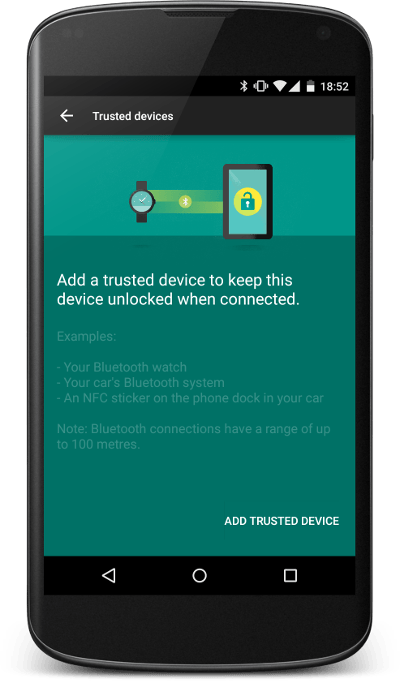
Android told me that I'd connected to a new Bluetooth device - did I want to set up smart lock?
For the designers out there, the text is coloured #389088;, and the background is #007166;.
Just how fucking readable is this?
Ensure critical text has enough contrastIn most cases, “sufficient contrast” means having a contrast ratio of 4.5:1. Enough contrast between the background and the text or critical elements allows all users, and particularly those with poor vision, to read text more easily. Smaller text needs lots of contrast, while big headings can tolerate a wider range of colors and backgrounds. Material Design readability guidelines
For those playing along at home, the above contrast ratio is 1.6. Pathetic.
The YouTube app's dark text also fails.
 Ratio of 1.8.
Google Play?
 Those menu items have a ratio of 1.9.
The Lollipop General Settings menu?
 The text gets a respectable 4.6. The icons a derisory 3.7.
I really can't be bothered listing more of the examples that I found - but there are dozens.
Lollipop is, for a large section of the population, really unpleasant to use.
I know I'm not the only person who has spent a lifetime working at a screen and appreciates legible text.
Now, I'll be fair to Google - the new Lollipop version of Android does have some very welcome improvements for helping men with colour-blindness.


Now, to be fair, this is an *excellent*
#Lollipop
update.
Great for accessibility.
pic.x.com/gmcqmklxtv


(Ok, that was a bit of snark, but these forms of colour-blindness disproportionately affect men.)
My Eyes Are Dim
Perhaps I need accept the inevitable and start wearing glasses? Perhaps I need to use a different phone operating system? One which understands the needs of all its users. Perhaps I need to lower my expectations and put up with a substandard product?
Google aren't a start-up any more. Android is not a side project. If Android is to thrive, it needs resources thrown at it to fix all those bugs and niggles which prevent it from excelling.
A product is accessible when all people -- regardless of ability -- can navigate it, understand it, and use it to achieve their goals. A truly successful product is accessible to the widest possible audience. Google's Material Design Usability Guidelines
15 thoughts on “Do All Google Employees Have Perfect Eyesight?”
David
They should take more hints from Apple when it comes to design and UX. The difference is staggering, but then again, Apple is one of few, maybe the only company that actually researches and puts money into this topic.
Fahran
For item one, the solution is Chrome's text scaling option, found in Settings > Accessibility. Completely obtuse to find, but works well. Also, infuriating to use if you only want it on one page!
Giles Knap
Yes I use this and it does word wrap as the OP requires for the specific text scaling applied - if you choose to zoom more then you get no further wrapping.
I have the opposite problem which is that since Lollipop this text scaling setting keeps changing itself and my fonts seem to get bigger and bigger - I keep needing to go back in and scale it down again. I seem to be the only person with this issue since I find no postings on the subject.
Bigmouth
Many websites don't respect the text scaling setting on Android Chrome. It's incredibly annoying.
Mark
You neglected to mention those wonderful Web designers who prevent zooming on their mobile pages. Argh! My half-century old eyes can't take it anymore!
Mark, Also under Settings and Accessibility in chrome is a Force Enable Zoom check box which will override the no-zoom setting.
Matt
There is a 'large text' option under androids settings->accessibility that increases the font size almost everywhere
Terence Eden
It does for some UI element - but many web pages still don't wrap the text even with font boosting in the system & browser.
Manny Wyche
This word wrap issue is a Kitkat and later "feature" by Google. Opera and Dolphin Browser have hacked in their own workarounds, but it is definitely a decision made by Google to maximize ad space anywhere in these operating systems. I've complained about it endlessly, even to the point where I think it should become an issue for lawyers to battle in the courts using the Americans with Disabilities Act.
https://code.google.com/p/android/issues/detail?id=62378
For me, I need the option for smaller text. Large text hurts my eyes. Small/Tiny is still too big. I have to solve this by changing my DPI to something making things smaller. But I agree on the color combinations...
Have you tried Settings -> Accessibility -> High Contrast Mode ?
mike whitney
Lead-in subject still pertinent today. Suggests Google has joined the to-big-to-fail club and can afford to ignore customer feedback. Never thought I'd consider an iPhone .......
Hugh d'Aubry
Whatever happened to "don't be evil?" Oh and 30/30 eyesight, nobody over 30 years of age, and requirements of H1B visas!
Eric
I found chromebooks with 1080p displays, plenty fast, google maintained, virus free(?) & stable for $314. I bought several for family & friends. Then I returned mine for not being able to configure an email client. No way to set readable system font or to get black text on white during email configuration, so I could not use the chromebook. That ended my chromebook purchases. Years later, I read that google still hates customers over 40 YO.
Trackbacks and Pingbacks
[…] Do all Google employees have perfect eyesight? » Terence Eden’s blog […]
What links here from around this blog?