I'm not a great fan of tablets. I have a phablet for day-to-day use, a TV for media, and a laptop for work. Tablets just don't fulfil any need I have. Which is why my 2012 Nexus 7 has been sat gathering dust since I bought it. Well, time to resurrect the little blighter and upgrade it to the latest and greatest OS that Google have to offer: Android 5.0 AKA Lollipop.
Getting and installing the image is fairly easy - follow the instructions Google provides - so this review will mostly cover my first impressions.
One of the first things you see is the WiFi set up screen. This allows the device to check for updates before you configure it. A smart idea. But, sadly, a fairly substandard implementation.


Yup, that word-wrapping is horrible. Is this a complete lack of testing on Google's part?
Next up is profiles. Rather than restore every last setting from your previous device, Google will let you choose which device to restore from.


Let me be quite clear. I currently use a Note 3 - that doesn't appear on the list. Neither do the half-dozen Android phones I've tested in the last year. All that's there is an LG that I haven't touched in 3 months and my Google Glass. How the hell do you restore Glass to a tablet? I know they're trying to converge OSes - but that's just silly.
Once set up, the default Lollipop has some... quirks...


There are lots of new features - many are probably quite good, if only people knew what they were.


I'm still struggling to understand what this means. Perhaps some diagrams, a use-case, or better written instructions would help?
As I said, there are some great improvements to Lollipop:


I'm also interested to see how the TalkBack feature has been improved. My mate Saqib ran a brilliant session at BarCampLondonX showing people how to use the iPhone if you're blind. I really enjoyed the session but was annoyed that my Android was so poor in comparison.
Material design is... ok... I guess. There's an emphasis on cutesy little animations and on screen shadows which I find a little distracting at best.
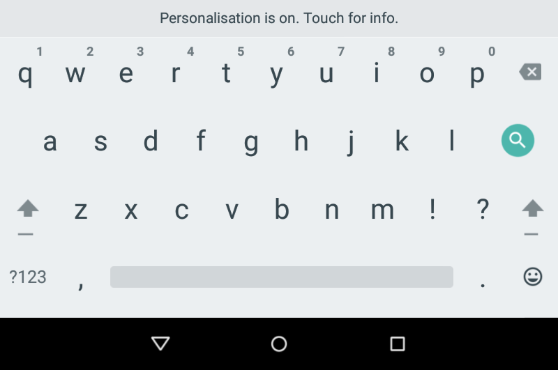
The "flatness" is really unappealing to me. I get that they're trying to move away from the tyranny of the skeuomorph, but I feel like this release has prioritised "good looking design" over "usable design." Take a look at the default keyboard.

So clean! So pretty! But, tell me, where are the key boundaries? Are the letters in the middle of the keyspace, or aligned to the side? Are the numbers on separate, tiny buttons?
It is surprisingly frustrating to type on. I found myself positioning my fingers really carefully - which is daft because the auto-correction is excellent.
A perfect example of the beauty vs functionality war going on is the low contrast text. I've just hit 35 years old, I don't wear glasses, and have pretty good vision. This fad for ultra thin fonts, in dark grey, on a pale background, is extremely hard to read. I'm sure that everyone at Google is under 25, gets mandatory Laser Eye surgery, and only uses their tablets in ideal lighting - but in the real world it's just a pain in the arse to read.
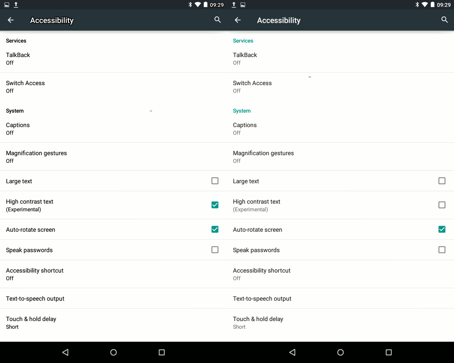
You can switch on high contrast text - and it makes a wonderful difference. Take a look at this animation.

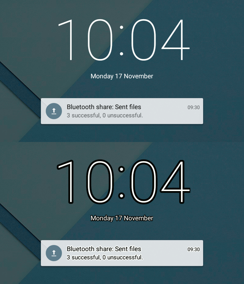
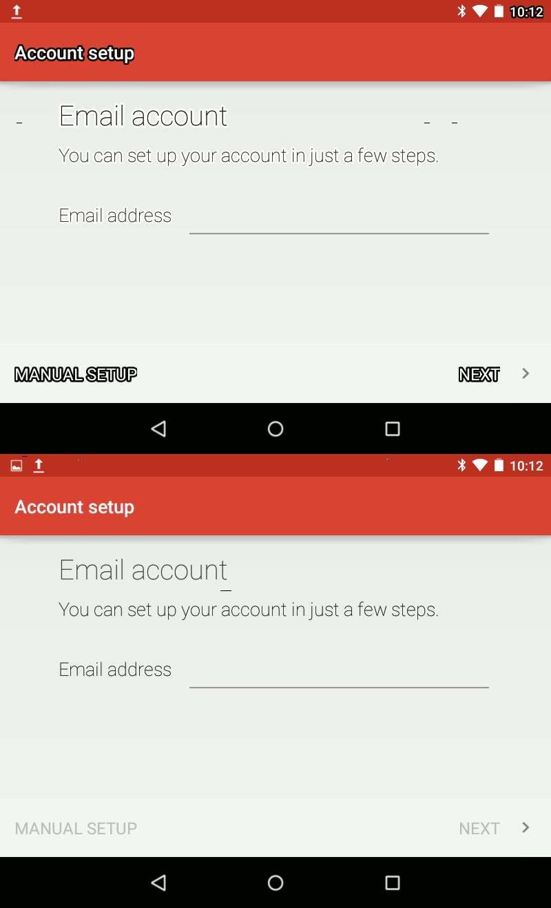
It makes pop ups and notifications so much easier to read. Does it look as beautiful with high contrast switched on? Probably not - but it will make actually using the damned thing a joy rather than a chore.
A great example is the lock screen. To quickly see those notifications requires readable text.

It's plain to see why this fairly vital accessibility feature is labelled as "experimental" - sometimes it just looks awful.
 (Those random horizontal lines are corruption from the default screenshot tool).
Overall
I've only been playing with Lollipop for a few hours. It's fine. While there have been a lot of back end changes, there's nothing so astounding that will make you change your mind about tablets - or about Android for that matter.
Yet, at the same time, there's a contradiction. People hate change. Look at the reviews of any app when the developer updates it. Or witness the fury unleashed on Microsoft for removing their start menu. People very quickly get used to a certain way of working - a certain look and feel. Every time you update the UI for an app, you're increasing the cognitive burden on a user. They just want to get something done - they don't care about your exciting new UI language, or your paradigm busting approach to interaction.
Lollipop looks lovely - mostly - but is it worth pissing off millions of users just so you can claim to look as gorgeous as your rivals?
2 thoughts on “First Impressions: Android Lollipop on a Nexus 7”
James Body
Pinning? 'Pinning for the Fjords'?
bill lorenz
Yes, keyboard sucks. Fix it by going to settings, language and input, Google keyboard, appearance and layout, themes and change to holo blue.
What links here from around this blog?