Earlier this year I was playing around with DogeCoin. Try as hard as I might, I just couldn't get their API working.
I delved into the settings, to see what was up.
Take a look at this setting, is it obvious to you which state is active?
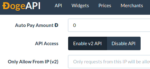
I clicked around on it, and the state changed.
Had this enabled it or disabled it?
By carefully hovering my mouse over the options, I could see what I thought was the active state.

Although, of course, I could have been wrong.
I don't know of any Human Interface Guidelines which specify that "Dark blue means on, light blue means off."
Here's the simplest way to do this in HTML
And, in code form
HTML
<form> <input type="radio" name="API" id="on" value="on"> <label for="on">API access is ON.</label><br> <input type="radio" name="API" id="off" value="off" checked="true"> <label for="off">API access is OFF</label> </form>
Colour does not have any inherent semiotic value. Some cultures use white to indicate purity, in other cultures it's the colour of death. Pink, in my country, was a masculine colour until fairly recently.
If you're a designer or programmer, think carefully how your users will quickly identify the position of a binary switch.
One thought on “Don't Use Colour To Indicate Binary States”
Irving Shrank
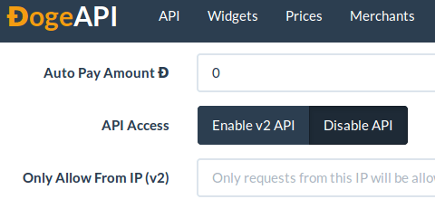
On top of that is v2 API the opposite of API ?