I love the TV Show True Blood. I really only watch it for the insightful social commentary and tasteful depictions of interspecies erotica. And the User Interface mistakes, obviously.
During the recent episode "I Found You", the Jessica (the Vampire) places a phone call to Sookie (a sort of telepathic fairy... it doesn't really matter...)
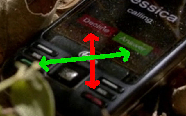
Sadly, Sookie has dropped her phone. Notice the obvious mistake?

Take a look at the dichotomy 'twixt the screen and physical buttons. The touch screen interface places the (red) Decline button on the left, and the (green) Answer button on the right. But the physical buttons are the opposite way around!
See here.

Humans very quickly build up muscle memory. They ignore what's in front of them and instead rely on learned behaviour. If you've ever had a new TV remote which puts the power button in a different position to your old remote, you know the frustration!
Consistency is the key to providing good user experiences.
Of course, the fact that the Kyocera X-tc doesn't have a touch screen really distracts from the mise-en-scène.
Why, yes, I do have a life. Thank you very much for asking.
2 thoughts on “Sookie Stackhouse's Phone Has A Dreadful User Interface!”
We're a strange species.
Why haven't we agreed a standard layout, so that the TV remote always has the power button in the same place? Like the pedals on a car.
@Edent this is important work, thank you
| Reply to original comment on mastodon.social