I'm sure that the Word Of The Year for 2014 will be Polinfographic - a hideous portmanteau I've just constructed of "Political" and "Infographic".
Infographics are the content-lite, citation-free, colour-heavy spurts of marketing jizz which have replaced the sound-bite as the political parties' weapon of choice.
Voters, apparently, can't remember such complex ideas as "Education education education" or "If you want a [racial slur] for a neighbour, vote Labour". So along comes the political infographic - specifically designed to be shared on social networks.
It's like watching particularly inept mad-scientists trying to create a memetic virus to ravage the whole world.
In the last few weeks, here are just a few of the Polinfographic I've spotted on Twitter.


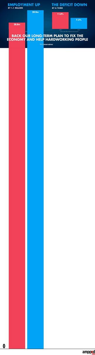
RT this graphic to support our long-term plan to fix the economy and help hardworking people.
pic.x.com/ckcxxzqifz

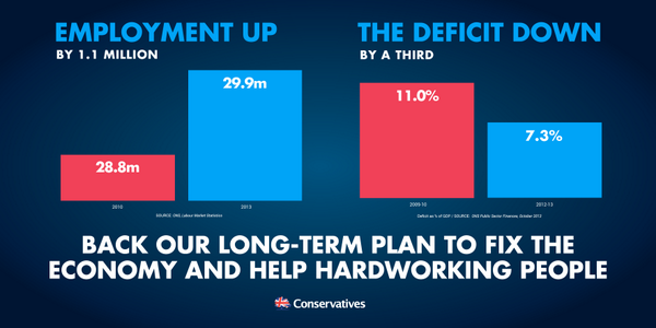
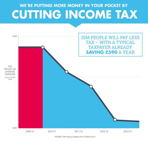
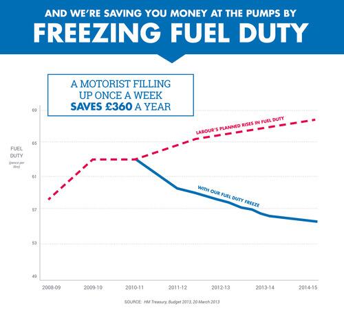
Charts are very popular with the Tories. Especially those with misleading or confusing axes.

25m people will pay less tax with typical taxpayer already £590 a year better off
#ShareTheFacts
pic.x.com/j5mjokiz6j

A motorist filling up once a week has saved £360 a year RT to
#ShareTheFacts
pic.x.com/8xu4z45qtp

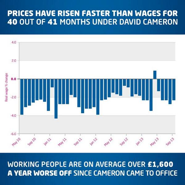
Labour also like to use spectacular charts - although theirs lack the visual punch and easy to grasp nature of their rivals'.

Note to David Cameron: here’s your cost-of-living crisis in an easy to understand bar chart:
pic.x.com/xoy6fzmb83

Labour mix it up a bit by including this sort of big central number Polinfographic - and include a hashtag to let others follow along.

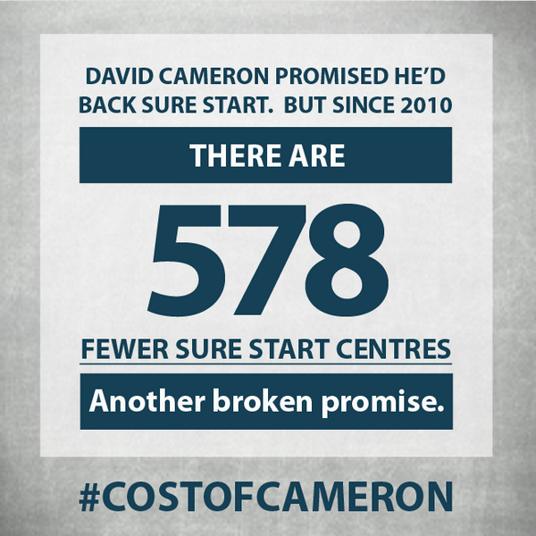
David Cameron promised he'd back Sure Start but they're closing 3 a week, 578 fewer since 2010:
pic.x.com/p24ihxlook

Then there are the Lib Dems. Bless.

Day 3
#whyiamIN
#adventcalendar
- Investment from EU companies creates thousands of jobs across the UK each year
pic.x.com/q6tbxe0tus


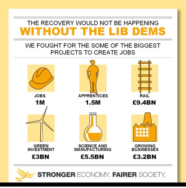
Economic recovery would not be happening without
@LibDems
in Government
#strongereconomy
#fairersociety
pic.x.com/quraxbi7pu

The SNP are fighting their referendum with a balanced mix of text and graphics

Today's
#indyplan
puts Scotland's future in Scotland's hands instead of being ruled by governments we rejected
#yes
pic.x.com/ugt9nyzmkx


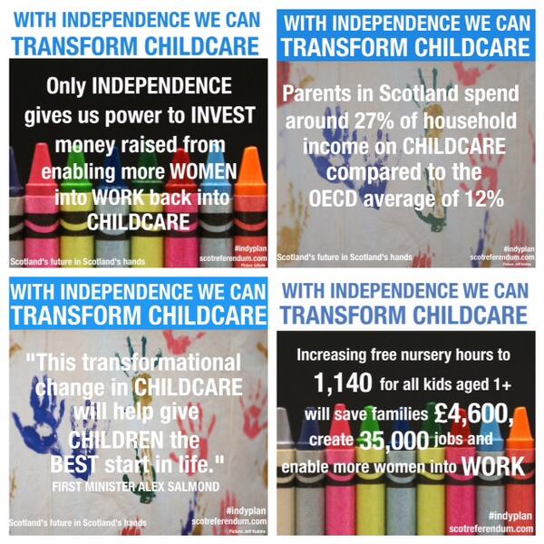
With independence we can transform childcare, saving 212,000 families up to £4,600 per year
#indyplan
#yes
pic.x.com/bsgppktf0l


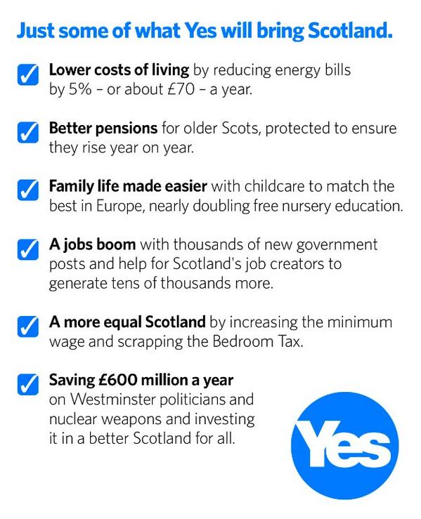
It's good to share! Six gains from Scotland's Future, a taster of what a Yes will bring
#Scotland
#indyplan
#indyref
pic.x.com/ggja98upmv

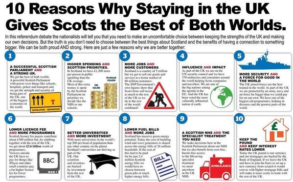
Their opposition also plays along

Just a few of the reasons why we think devolution gives Scotland the best if both worlds inside the UK.
#bbcqt
pic.x.com/odolbzgqxe

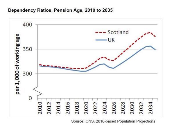
More on ageing pop. Here's graph the statistics watchdog issued when he rebuked Nicola for misusing stats.
#bbcqt
pic.x.com/fb7ymdwjhn

General Election 2015
We're still over 500 days away from the next general election. It appears that the parties are going to be in a permanent state of tub-thumping.
There's no doubt that some of these infographics are good political tools - they're short, punchy, and designed to go viral. Others are poorly constructed messes which may be shared only for purposes of ridicule.
Disturbingly, like most infographics, they're almost entirely lacking in context or reasonable methods of citation. The scales used on some of the Conservatives' graphs would fail a maths GCSE.
RT this graphic to support our long-term plan to fix the economy and help hardworking people.
pic.x.com/ckcxxzqifz
 @TheMirrorEarth
 The Mirror
Replying to @Conservatives
Hey
@Conservatives, we fixed the scale of your bar chart for you.
pic.x.com/7eyoh66adj

It will be interesting to see how these get shared and remixed. I wonder if the British public is smart enough to reject some of the most misleading claims - and I wonder if a political party creating the perfect meme will nudge the election one way or another.