In October, I was interviewed in Econsultancy about the BBC's new "responsive" website.
I said:
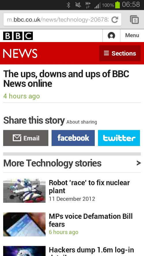
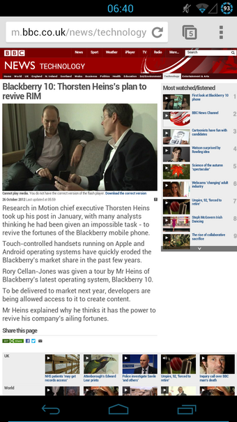
The BBC's mobile site is fairly responsive. If you view it on different sized phones and tablets it adapts quite well. But it is an entirely separate site from the main BBC news site. The BBC are doing device detection and redirecting mobile users. It's not a bad strategy per se - but it is not best practice
Clicking on a link on the BBC's front page today, lead to this "responsive" experience.

A completely blank page. The full-fat site contains a clever chart.
Ideally, your mobile site should contain the same content as your main site. It's not a huge sin if it can't (for technical reasons) but you need to ensure that your CMS detects pages which are unsuitable for mobile and ensures that links towards them are removed.
Otherwise, you end up in this silly situation where mobile users are served content which you simply can't show them.
Of course, the reverse can be just as bad.

Come on BBC, sort it out!