QR codes - Bigger Doesn't Always Mean Better
As regular readers know, I'm a big fan of QR codes. I often castigate advertisers for poor usage, bad placement, and inaccessibility.
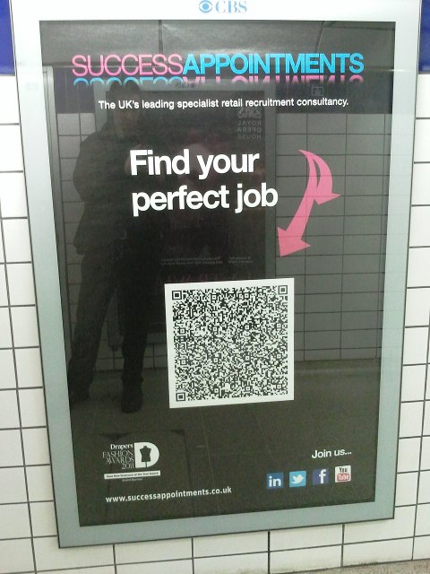
I can just imagine how the conversation at the offices of Success Appointments went...
"Dave, we need a QR code on our advert!"
"Righto, Fred!"
"It'll be on the tube, so it has to work offline."
"How about a VCARD - that way when you scan it, our address will appear on your phone?"
"Perfect! But..."
"What?"
"Can we make it nice and prominent?"
"Of course..."

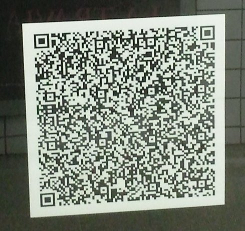
Let's take a closer look at this behemoth:

What surprised me most was, once I waited for the train platform to clear, and pushed myself up against the wall so I could fit the code in my viewfinder, the code scanned!

This QR code has set the Error Correction to "High". That's usually a good idea when the code is likely to get dirty or damaged - but it does rather balloon the code.
Let's take a look at the payload:
BEGIN:VCARD
N:Appointments;Success
TEL;TYPE=FAX,WORK:
TEL:020 7759 7337
TEL;TYPE=VOICE,MSG,CELL:
ADR:;;York House, 23 Kingsway;London;;WC2B 6UJ;
ORG:Find Your Perfect Job
TITLE:
EMAIL:info@successjobs.co.uk
URL:mobile.successappointments.co.uk
END:VCARD
There's a whole host of empty fields, needlessly inflating the code size. The phone number is incorrectly spaced and doesn't have international formatting.
If they were sensible about it, dropping the redundant fields and dropping the error correction, they'd end up with a code like this:

That's a code less than half the size. Same functionality and much easier to scan. And, hopefully, looking slightly less ridiculous.
dhmnjkflg says: