Seen in the latest issue of Sport Magazine - this rather interesting QR advert for Wall Street: Money Never Sleeps.

This is a really well executed campaign which should serve as a template to other advertisers. There are, of course, one or two issues that I have with it. Let's start by zooming in to the QR Code.
Explanatory Text
It's great to have a little note to explain to people what to do with a QR code.
 A couple of interesting points.
- It recommends get.bee ttagg.com - this is misspelled. It should be get.beetagg.com - only one "T".
- It's interesting that they've used Kaywa to generate and manage the code - yet they don't recommend Kaywa's reader.
- Finally, the wording is a little clumsy. I prefer "app store" (singular) rather than "apps store" (plural) - but that's just my personal preference.
Redirection
Using HTTP redirection to send visitors to another site automatically is usually quick - but there are pitfalls on mobile. Because of the latency inherent in mobile transmissions, multiple redirects are to be avoided where possible.
In this case, the redirection goes
- Phone connects to Kaywa.com
- Kaywa.com redirects to trailerqr.com
- trailerqr.com redirects to wallstreet.mymovies.net
- wallstreet.mymovies.net detects the phone and starts serving the correctly formatted video
So, the phone has to create three different HTTP connections to three different servers to get the content. In areas of good coverage, that shouldn't be a problem. Where possible, you should seek to minimise the number of redirects.
The Video
As I've said, a differently formatted video was served depending on the handset requesting it.
Although they were appropriately sized (320 x 240 @15fps or 400 x 224 @25fps) I found them to be a little heavy. At 2 minutes 30 seconds, the trailers certainly represent value for money - but they weigh in at around 5 MB.
 Again, this isn't a huge issue if you're in good 3G coverage and you're not being billed per MB.
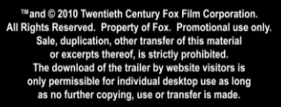
Finally, there's a very odd copyright notice at the end of the video.

Overall
A great campaign - scan and go straight to the trailer. There's not much to improve, but keep these points in mind for your next campaign.
- Check that the URLs you print are valid. There's no excuse for the beettagg spelling error.
- Make the URL human friendly if possible. It gives the user confidence that the destination is something in which they're interested.
- Don't have too many redirects. Remember there are specific considerations when working on mobile.
- Consider your audience's limitations. Is a multi-MB file going to cause problems for them?