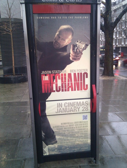
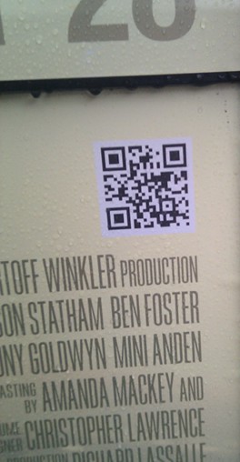
The Mechanic QR Code
Another day in London - another sighting of a QR code!
This time, on a poster for high-brow art-house flick The Mechanic.

Quite close to the bottom of the poster - so low, I had to kneel to scan it - is a QR code.
 Scan it and it takes you a mobile friendly trailer on YouTube.
Issues
It wouldn't be a Terence Eden blog post if I didn't criticise the approach taken by the advertisers.
- QR code is far too low down - who wants to stoop to scan (other than nerds like me)?
- No call to action. No one knows what this QR codes goes to until they scan it. You need to give someone an incentive to scan. Here's a very quick mock-up I've made to show how I think it should be.
-

- Short URL - even if you do scan the code, you still have no way of knowing where it's going. The qrs.ly service is provided by QR Stuff who don't offer editable URLs. Their premium service does offer all sorts of statistics and other options. But for a customer facing code, a friendly URL would probably be better. http://qrs.ly/Trailer for example.
So, overall, great use of a QR code to direct people to the trailer - but a little more effort on the call-to-action would have made people much more likely to scan the code and view the trailer.
I also just launched http://www.SocialQRCode.com which is the first QR Code generator designed for social media and social sharing for businesses.
Please give it a try!