Way back in 2010, I was sent a Nokia N8 to review. It was dreadful. Simply one of the worst devices I've ever used. My original ranty blog posts have been lost from tumblr, so I've reposted it here as a single post. It is pretty slapdash. I've added some commentary. Warning! There be swearing ahead!
On signing in to the N8, I was prompted to log in with my Ovi account. I have an account, but I can't remember the password. In order to retrieve it I must prove that I am human.

Oh, cool! A captcha when I try to recover my password. I’ll just type it in… Wait! What? I have to remember the captcha as well? Grrr….
Not only do I have to memorise it, I've got to try and type it in on a crappy T9 keypad! Why? Because the N8 doesn't support a portrait QWERTY keyboard!
One of the first things I do on a review phone is wipe it.
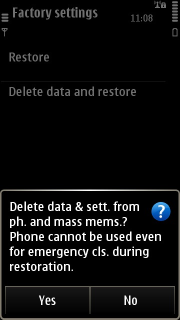
Considering how often you’ll need to resent the damn phone, this isn’t a very professional message. Why can’t the message box expand? Fckd if I knw.
This is a delightful usability fail.
Clicking “delete” pops up a box with a header and Yes/No buttons. Only the buttons are clickable.
Clicking on a link pops up a box with a header, a cancel button and a blank button. The header is clickable.
Consistent – kənˈsɪs tənt
I JUST WANT TO DISMISS THIS MEETING REMINDER!
NOKIA - WHY DO YOU HATE ME?
The web browser is pretty crap.
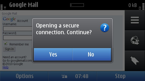
Fuck No? Why would I ever want to use a secure connection on the Internet? Guess what? There’s no way to permanently remove this “helpful” message.
The misleading battery indicator was a nice touch.
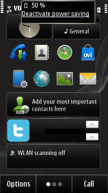
There are only 5 bars showing. Mind you, there are only 7 bars in total. That’s nice and intuitive, isn’t it…?
The entire UI was a collection of bugs held together with bug juice.
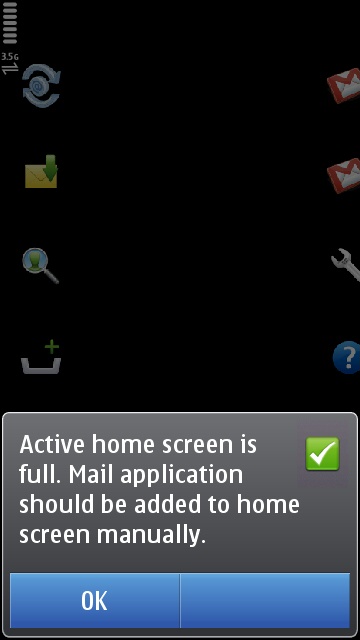
A) WTF? There’s loads of space there?
B) What is going on in the background?
C) Android is quaking in its boots.
There were loads of weird help options hidden within the UI. Here are two of my favourites.
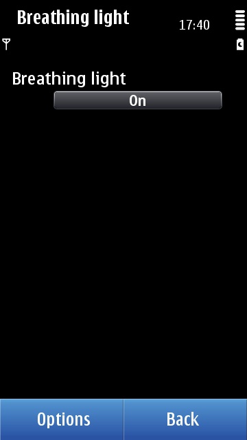
Just what’s needed to beat the iPhone. A “Breathing Light”. What. The. Juddering. Fuck?
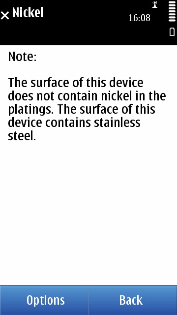
Damn. And I was going to sell the N8 for scrap.
The UI was a weird mish-mash of "modern" touchscreen Symbian and "physical buttons" Symbian. Here's a particularly good example.
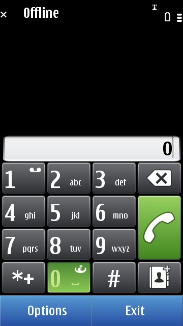
See that weird symbol on the Zero key? That launches the web browser. No! Seriously! It does! Because everyone starts to dial a phone number and then thinks “Damn, wish I could go to the web instead…”
Fun fact - 99% of people surveyed think that the icon resembles a phoenix rising from the ashes. It doesn’t.
Symbian was just full of legacy issues. Because of the N8's "unique" unibody design, you can’t open it. No user replaceable battery. No switching the phone off to change SIM card. Naturally, the OS hadn't been updated to reflect this.

Wait… What? Once I rip my fingers to shreds trying to open the rubber flap to get at the SIM card (no iPhone blessed paper-clip here) I have to restart the phone? Why? iPhone doesn’t do this. Android doesn’t do this. In fact…. no phone I’ve ever had asks you to restart the phone when you change SIM. What gives, Symbian?
The N8 does not have Ovi preinstalled!
When you go to the app store for the first time, you go to a website which then asks you to install Ovi.
This process takes ages. Well… 2 minutes. See for yourself in the video.
Why Nokia? Why? Why not just pre-install Ovi? Would it really be that hard for your teams to talk to each other?
Oh, and while you’re at it, sort out the install process. When the bar reaches the end - that means the install is done. It shouldn’t mean I have to scratch my ass for another few minutes.
While I’ve got your attention - why don’t those animated gifs rotate smoothly? What’s wwwwwwwwwith the judddddddddddddddddder?
FYI - here’s how it works on Android. Click on Market - Market launches.
Pretty much the same on iPhone and BlackBerry. You guys should totally buy one of your competitors’ devices. They have this thing called “out of the box experience”. It rocks.
Of course, once you install Ovi - it doesn't work properly.
My thought process…
1) Hey! There’s a WebTV icon taking up valuable screen space. I bet there’s something really amazing in there….
2) I… uh… oh… What? A single icon? No cool stuff for me? Why not just take me into Ovi rather than pushing another icon? Oh well… at least I’ve already installed Ovi. I can just click on the Ovi icon and go straight to the Ovi marketplace I already downloaded. Right?
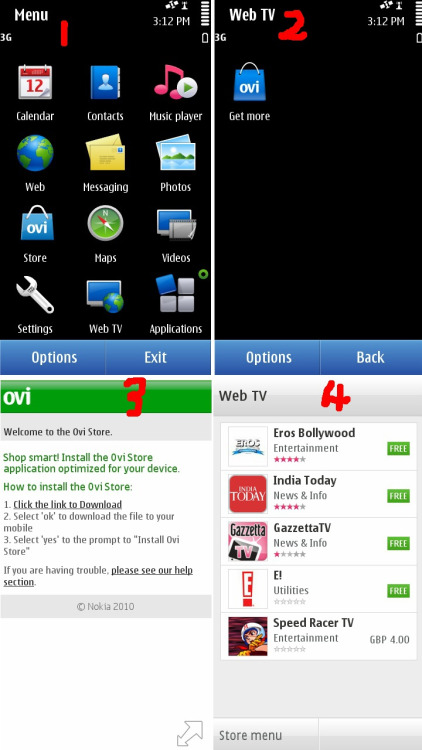
3) Kill. Me. Now. Despite having already installed Ovi - this piece of stainless steel encrusted excrement has taken me to the web and wants me to download it again? Ah… no… it says I should download it again. But it automatically opens the Ovi store. I hope this is worth it.
4) This is literally the most depressing thing I’ve seen. Don’t get me wrong, I love me some Erotic Bollywood. I bet people from / in India are well chuffed to see India Today on there. What else is there? Hmmm… a 1 star rated “Gazzetta”. Something called “E!” which is apparently a utility. Or I can pay 4GBP for a cartoon.
No.
No. I simply don’t believe that this is what I am being offered. I refuse to believe that Nokia are this cack-handed. I’ve obviously got a defective unit with a defective Ovi store. That is literally the only explanation that makes sense. Who in their right mind at Nokia would have approved this? An icon that leads to another icon that leads to a web page that leads to a store with only 5 items in it?
Are Nokia playing a practical joke on me? IT’S NOT FUNNY GUYS!
This is the Nokia Ovi twitter client which is installed by default. It’s called social.

Notice the delightful light blue text on a light grey background. That’s SUPER EASY to read.
The client doesn’t support new style retweets either.
FFS. Shooting a video on the excellent 12MP camera. Can I play it back? Can I fuck.
I hope that my N8 is broken. I really do. That’s the only excuse I can think of. How hard is it to test these things?
It's not just me! My good friend RadioKate was practically in tears describing this horrible phone.
My original feedback to Nokia was "I actively resent using this device." It was true. The N8 was the nail in the coffin for Symbian. The N95 came out before the original iPhone and was hugely competitive for a non-touchscreen device. They saw the twin threat from Apple and Android and slapped a crappy touchscreen shim on their OS. It wasn't nearly enough. They pissed away their advantages until it was too late. The inadvisable switch to Windows Phone then killed the company. Shame.
3 thoughts on “N8 Fail - Reasons Why the Nokia N8 Sucks”
The UI on the early iPhone and Android devices was rudimentary compared with what we have today - yet compared with this pile of steaming pooh you can see why overnight Nokia went from Global handset leader to has been...
Terence - I really appreciate your insight and no nonsense skill at presenting your experiences. Thank you for sharing!
@Edent I worked for Nokia (actually Ovi Maps then Nokia Maps then Nokia Location and Commerce, then HERE Maps but that's another story) between 2010 and 2013 and was issued an N8. I tried and failed miserably to get my hands on an N9 instead; they were like gold dust even inside the company. So I just continued to use my iPhone instead. That about sums the N8 experience up.
| Reply to original comment on mapstodon.space
@Edent Even way back in 2002 I was disappointed when I got a nice-looking colour Symbian phone, the UI felt more like going back to Windows 3.1 than a worthy successor to the simple one-dimensional hierarchical menus... but they kept on pursuing it
| Reply to original comment on crispsandwi.ch
What links here from around this blog?