When I was a student, I had a brilliant idea. Why not have a stand at every train station where you could sync your Palm Pilot with the latest news?
Insert a pound in the slot, press the button for The Times, aim your handheld's IrDA at the blinking light and ZAP! All the latest news for you to read on your train journey.
It's just as well that my idea never got out of the paper prototyping stage. While BlueTooth has supplanted Infrared in the majority of modern phones, it is network provided data which is now king.
The Daily Show did a wonderful interview with the New York Times. The interviewer asked the editor...
Can you show me one thing in this paper that happened today?
And, of course, the answer is "no".
I remember on that dreadful day in September, barely a few hours had gone by before the first "extra" editions of the Evening Standard had pictures and analysis.
A few hours? That feels like a life-time. Especially when it comes to breaking and developing news. There is a huge lag between a reporter typing away, the presses rolling, and the delivery drivers depositing the paper on the streets.
The Internet totally eliminates that lag. A journalist can clatter words onto a laptop and with a push of a button have them broadcast to the world via their website.
The Web is Too Slow
I simply can't wait until I'm back at my desk. Nor can I be bothered to boot my laptop, find some Wifi, find some power, load FireFox, etc...
Flip open my phone, click news, read. That's what I want. And that's what I can get. For breaking news, the mobile Internet is the only real solution.
What's Available
I present here a quick overview of the most popular British Newspapers' mobile sites. I've also included the New York Times for international flavour and Reuters for the agency view.

List of mobile newspapers - spot the favicon
I don't intend to comment on the politics of the papers, nor their choice of stories - I'm going to concentrate on the first impression only. Later I'll do a full review of their capabilities.
The first thing to spot is the use of the Favicon. Favicons are the little icons which are used to differentiate your site from others. Think of it like a visual bookmark. Bizarrely, half of the UK papers don't use a Favicon. That means that in the bookmarks list they are likely to be overlooked.
A special mention for Reuters' Favicon (highlighted) - It's an indistinct yellow splodge. I've highlighted it because it's hard to see yellow against a grey background.
FT.com - http://m.ft.com/ 🔗

m.FT.com
Traditionally printed on pink paper, the mobile site seeks to replicate the distinctive hue of its paper counter part. From a branding perspective, this instantly tells the user that they are on familiar ground. It doesn't affect the readability - so why not.
Showing the time next to a story instantly tells the reader how "fresh" the content is. Confusingly, there's no date displayed.
Search is always important to readers; allowing them to get straight to the content they want. Not having any navigation is a hindrance to users quickly finding their way around. While users will scroll to get to navigation - placing it at the top is an easy way to let them choose where to go next.
While advertising is a necessary evil, this advert is hard to read and jars with the rest of the page. The layout of the whole page seems very heavy on the dead-space.
Guardian - http://m.guardian.co.uk/ 🔗

m.Guardian.co.uk
I've already reviewed the Guardian - but to my mind it still stands out as one of the best examples of mobile news sites. Compact and efficient layout, navigation, teaser images, and the date all contribute to a well designed first impression.
The Independent - http://m.independent.co.uk/ 🔗

m.independent.co.uk
Dispensing with navigation has allowed The Independent to cram a few more stories above the fold. Although their teaser text hasn't been optimised for the size of the screen leaving some rather jarring dead-space.
The colouring is rather plain, but fits in well with the paper's brand. Colouring the background space given over to the advert is an interesting design choice. It simultaneously draws attention to the advert while keeping it conceptually separate from the rest of the site.
Metro - http://metro.mobi/ 🔗

metro.mobi
The Metro is technically a newspaper. The mobile site reflects the paper version - cheap, cheerful, primary colours and a blonde on the front page. The total dominance of the image detracts from the rather good navigation choices - split by category. The masthead is perhaps a bit large - but the promise of the image will probably be enough to get 50% of the population to scroll down.
It's interesting to notice that there are no stories or direct links to stories to be seen.
New York Times - http://mobile.nytimes.com/ 🔗

mobile.nytimes.com
They "Gray Lady" lives up to its reputation with a very plain site which, nevertheless, packs in a lot of information.
Using an anchor link to get to the navigation is a smart choice. It reduces clutter at the top while keeping navigation options available. With intelligent use of space they've also crammed in a search box. The date and time give the viewer the reassurance that the news they are reading is not stale.
Unlike the other sites, the NYT places images on right. While this is distinctive, readers of English are accustomed to a flow of information from left to right. I wonder if this style helps or hinders readability.
The link to a dedicated application is a smart touch and will probably upsell readers. Unfortunatley it comes at the expense of looking like it is part of the headline. A less subtle change of font, colour, or placement would help here.
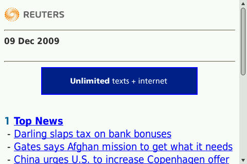
Reuters - http://uk.mobile.reuters.com/mobile/uk/ 🔗

uk.mobile.reuters.com
Reuters is not a newspaper. It is austere and feature poor. Deliberately so - it caters to those who want the news without any fuss. That said, they do make poor use of the space available; only the lower third contains any real content. It makes a nice change not to have an advert at the very top of the page - but the heaps of space aren't really necessary.
Shifting the masthead and date on to one line, then removing some extraneous space would provide a better first impression by bringing more news to the forefront.
The Sun - http://thesun.mobi/ 🔗

thesun.mobi
The Sun is Britain's biggest selling paper. Unlike the others, they totally eschew advertising at the top of their site.
The page is strongly branded and very picture heavy - that's likely to negatively impact download times. Navigation is very clear but it is missing search. They have deliberately taken the paper's style - the ripped edges of the image, for example - and applied it directly to the mobile. That's not always a great idea, but it certainly makes it stand out from the crowd.
Times - http://timesmobile.mobi/ 🔗

timesmobile.mobi
I've reviewed the Time before. I find the logo unnecessarily large. It's great that they've got the date and time on there - but giving them their own line feels like an inefficient use of space.
Essentially, over half the screen is wasted here.
Mirror - http://m.mirror.co.uk/ 🔗

m.mirror.co.uk
The Mirror's mobile site feels dominated by its advert - yet, impressively, they still manage to keep 3 stories above the fold.
There's no navigation or search. Indeed, it's as simple as you can be without the barren space typified by Reuters.
While offering a good amount of news - this really gives the impression of being Lidl's site, with a bit of news thrown in. Adverts should be carefully designed not to swamp the pages on which they live.
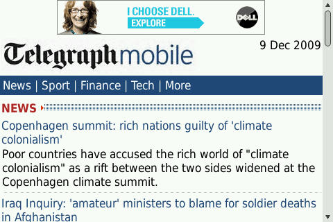
Telegraph - http://m.telegraph.co.uk/ 🔗

m.telegraph.co.uk
Alphabetically last, The Telegraph is a rather mixed bunch. The only images are an advert and its logo. The navigation and use of date are well integrated. Despite this, they can only fit two stories above the fold.
There are no images to entice the user - although the text rich screen does convey a depth of purpose that the others may be missing.
Conclusion
It's important to remember that users will scroll. The idea of putting important assets "above the fold" is, at best, a distraction. But there's no denying that the first impression really does count.
It's heartening to know that the UK's mobile (mainstream) news market is so vibrant and healthy. While they differ in functionality and content - these sites show that providing news on the mobile is no longer a niche activity.
Mobile news sites come in a wide range of shapes and sizes - demonstrating that mobile needn't be static and simplified.
These sites - despite their problems - are evidence that mobile news, for many people, is the news.
6 thoughts on “Mobile Newspapers”
Remove the reference to 'Directory' and this is why there is issues with the mobile offerings of these publishers. Mobile should offer a great opportunity for publishers to reap serious revenue but they have to approach in a different way.
Inside Track: The Race To Deliver Value In Mobile Advertising; Will Directory Publishers “Get” It? Article: http://www.indigo102.com/blog
michael ohajuru
Interesting summary are but aren't RRS feeds quicker and simpler for news updates - easier to access and have simpler UIs ?
That's a good point - but it depends on the RSS reader used. I'm a big fan of Viigo for reading RSS on the BlackBerry. But not every phone has such a powerful reader.
Given that many RSS feeds direct users to the full story on the web, it's vital to have a good mobile version.
michael ohajuru
at the risk of this turning into a love in ! You' too have a good point ...the RSS readers on the iPhone are restricted by not being able to use the browser effectively a good RSS with links to and from the web/browser are what I miss from Nokia's swiss-army-knife of mobile phones the N95 but I'm not going back the iPhone offers too/so much more.
http://uk.mobile.reuters.com/mobile/uk/
That's a URL even its mother would struggle to love.
To be fair to Reuters, the actual URL is http://m.reuters.co.uk/ - it just redirects to the URL you've mentioned.
What links here from around this blog?