America and Canada both celebrate a holiday called "Thanksgiving". Although, for complex reasons, the celebrate it at different times of the year. Outside of North America the holiday simply doesn't exist. Much like the US doesn't celebrate Guy Fawkes night - the British don't celebrate Thanksgiving.
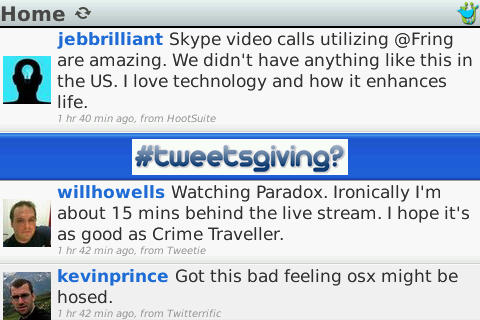
So, I was a little surprised to see this advert for #tweetsgiving on my mobile.

What is tweetsgiving?
For now, let's ignore the perils of assuming that your country is the entire market place. It's a common problem which, sadly, is prevalent in the USA. I clicked on the banner like a good consumer - hoping I'd find out what #tweetsgiving was.

Unavailable
I've talked before about having your service ready for the floods of people who are going to visit. You only get one chance to make a first impression - this first impression says "We're broken". Would you trust this site with your money? With your time? Would you click on the same banner again?
Well, I'm, a fool. I waited a few hours. Teething problems, I reckoned. Later on in the day - when I saw the same banner - I clicked.

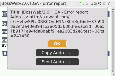
Oh Dear
I was greeted by an unfriendly error page.
Third time's the charm. In my pursuit of finding the worst Mobile Badvertising out there - for you, dear reader - I clicked. Once more unto the breach...

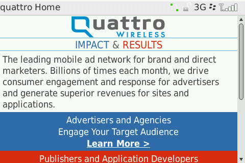
That's It?
So this is what the advertising campaign is for? A block of text. No images. Nothing to convince me that it's genuine. No details about the charity - if it is a charity - or the projects in Tanzania. And - were I charitably minded enough to pay - no method of payment for those outside the USA.
How To Fix This
- Friendly error pages. Things break, that's a fact of life - but when they do, ensure that they fail gracefully. Make sure that your error pages are still useful to your prospective customers.
- If your site is broken - or under severe strain - withdraw the advert until you are sure you can satisfy demand.
- If your offer is limited by region - try to ensure that it is never seen outside that region.
- Given that the Internet is international - offer alternative ways for foreign customers to pay you.
- Make your site attractive. You don't need to go overboard, but a few images, links to other sites or pages, downloadable content, will attract more customers that plain prose.
- If you're asking for money for a charity - show your potential donors that you are genuine. In this case a link to the charity's site would have helped. In the UK, all charities have to be registered - I don't know if the USA does something similar.
While I'm sure that the aims are laudable, this is truly a perfect example of Mobile Badvertising. The site doesn't work and, when it does, you wish that you hadn't bothered. What a waste.
Bootnote
There is one good thing about this Badvertising. The link to Quattro Wireless does go to their mobile page and not to some Flash-ridden abomination.

Quattro Wireless's mobile page