It's been a while since I did a screenshot based review of a mobile app. I was gratified when QR Pal asked me to review their new app.
First thing's first, this is a great idea for a QR Scanner. It saves all your scans - so you can retrieve them by category, it checks to see if links are safe to click on, it allows you to share scans with friends, and it also has a gameification element.
But I really don't like it. It's slow to start up, has a UI which is only really suitable for iPhone users, and has some basic usability flaws.
On With The Review!
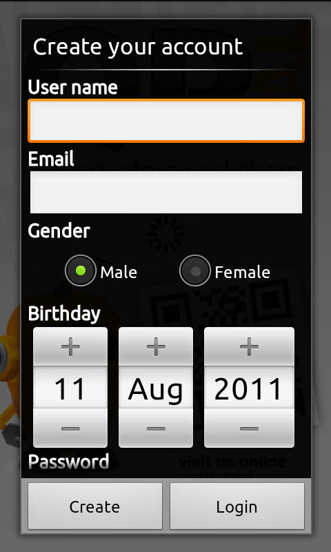
The first thing you have to do is set up an account? Why? I just want to scan me some QR codes!
 I now understand that there are a bunch of social features - but that's not explained here. Just "give us all your personal details for some unspecified purpose." Hardly encouraging.
The email field doesn't tell the Android system that it's for email - so there's no @ key present on the keyboard. Annoying oversight.

It gets worse. There's a password field which doesn't tell the user the password parameters! How long does my password have to be? Do I have to use mixed case, numbers, symbols? What?
 So, of course, after submitting, it tells you that you did not pass the stringent password requirements.

As a side note - if you were sending an email to people who had registered on your mobile app, would you make the email mobile friendly?
 QR Pal didn't. I don't understand why. They know this email is probably going to an Android phone, why didn't they make sure the email looked perfect on the device?
So, on to the app itself...
 This, may I remind you, is an Android app. Yet their UI has been lifted wholesale from their iPhone app.
The UI will be totally unfamiliar to anyone who is used to Android apps and the way they work. Pressing the Android's menu button does nothing.
Even the settings page is iPhone-styled.

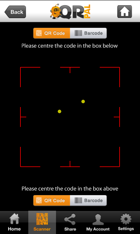
Scanning codes is as quick as any other scanner - and seems to work as well.

Now, I say "quick", but you have to wait a good 5-10 seconds after clicking the app's icon before you can scan. Why? Because you have to see their splash-screen.

Now, there are a few nice features - checking to see if a URL is likely to be harmful is one.
 Of course, it means that you are sending all your scans back to the QR Pal mothership. I wonder what they do with them all?
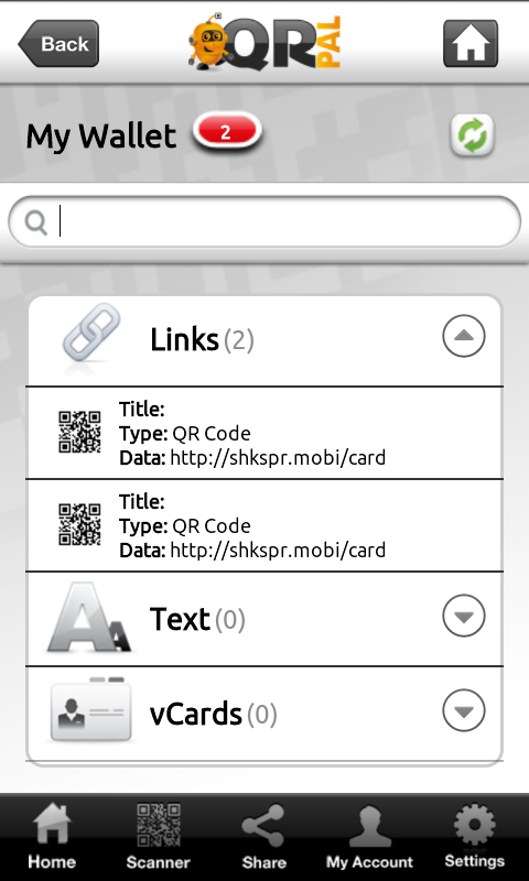
Once a code is scanned, it's saved in your wallet. Scans are grouped by category.
 Sadly, they don't check for duplicates.
Conclusion
The thing is, QR Pal is chock-full of good ideas.
Integrating with Twitter, LinkedIn, and Facebook is a smart move.
Checking links for safety is a bit of a gimmick, but a good differentiator.
Their live map of scans is cute - although the app never asks for my location.
They have a "points" system - but it's never really explained why, how, or what it's for.
You see - every idea they have is good, but none of them seem fully realised. Making the whole UI look like an iPhone app makes Android users feel like they're an afterthought. I doubt it will play well on BlackBerry and WP7 when they launch.
But the absolute killer, for me, is the start-up time. When I want to scan a code, I want to scan it right there, right then. I may be on a busy street, about to get off a train, or taking someone's business card. I do not want to watch QR Pal's splash screen.
My preferred scanner ZXing for Android starts instantly. It doesn't do all of the fancy stuff of QR Pal - but it doesn't need to. It's quick, simple, and all the features work.
QR Pal is a great idea for an app. But they need to fix the UI, start-up speed, and finish the features they've started. Once it's done that, it will be an excellent app.
2 thoughts on “QR Pal - When is an Android App not an Android App?”
It looks like they Phone Gap'd the mobile site from a UI framework that has been ported over... perhaps. I think this is one of the main reasons when developing cross platform I use Appcelerator, as it helps me create a platform specific UI.
I have real issues about apps that require some form of login before reaching functionality - I often give up before completing the task at hand.
Regarding the splash screen, is this shown when the app loads for the first time or after the app has loaded and you select the scan option ?
Heya Ketan,
The splash screen appears as the app is loading originally, though once open you can enter general settings and switch off the splash screen. Hopefully this answers your question. Feel free to ask any more questions, either email this address, tweet or facebook me. If you're interested check out our website for more reviews.
Cheers for the interest.
QR Pal Team
Email: info@qrcodepal.com
Official Website: http://www.qrpal.com
Twitter: http://www.twitter.com/qrcodepal
Facebook: http://www.facebook.com/#!/QRCodePal1