In this Mobile Badvertising series, I regularly pick on the Guardian. I don't have anything against them - they're my favourite mobile news resource. It's such a shame that the advertising they have on the site is atrocious.
Samsung Galaxy S
The Galaxy S is Samsung's latest Android handset. There are so many Android phones out there that you need a really great advertising campaign (or a really great product) to stand out from the competition.
Let's take a look at the Samsung campaign.
Small Isn't Beautiful
The advert is disproportionately small compared to the rest of the site. The Android phone I'm viewing on has a screen width of 480 pixels - the advert looks tiny and pathetic.
At first I thought it was the Guardian mangling the advert - but a look at the URL http://images.mpression.net/image/11251/galaxy_banner168x28_v2.gif shows that 4th Screen have decided to serve up a 168*28 image.
Tiny Banner Ad
Worse than that, they've blindly resized the image rather than rework it. Take a look zoomed in - the text is illegible.
The Micro-Site
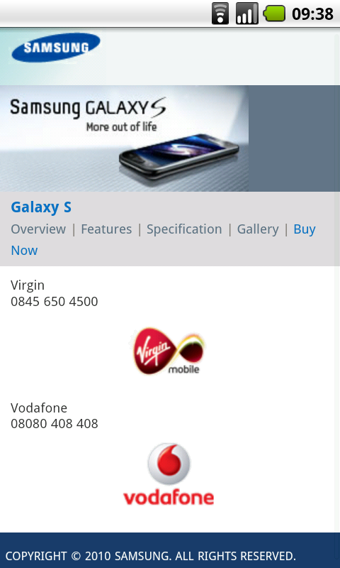
The site behind the advert isn't too bad. But there's nothing exciting about it. Just a series of static pages. You can visit it at galaxys.co.uk/
What Do You Want Your Customers To Do?
With every mobile advertising campaign, you need to think about what it is you want to accomplish. This campaign is, presumably, designed to encourage people to buy the Samsung Galaxy S phone. So, it would make sense if people could buy the phone from the site. No?

Try to buy the phone from this page
There are three glaring mistakes on this page. Can you spot them?
- No mention of price. Is this pre-pay or contract? Is this a premium product or a cheap and cheerful device?
- No click-to-call. Those phone numbers should be clickable and should take the customer straight through to the dedicated Galaxy S representatives.
- Those images of the phone company logos are clickable - yet there's nothing to suggest they are.
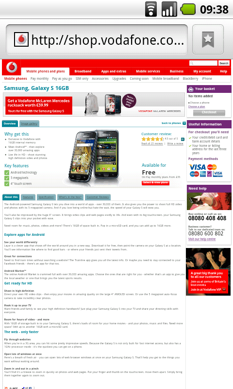
Still, clicking on those logos will let me buy the phone through a mobile-friendly shop. Right?
Mobile Companies Who Don't Do Mobile
eTailing is hard. Getting a web based shop up, running and profitable is tricky. Getting a mobile version of that site can be even harder. But if there were ever a company to do it well, you would expect them to be a mobile company. Sadly, that's not the case.
So, our hapless user can't use her phone to make a call to buy the handset, she can't use the web browser to buy the handset. Is she supposed to wander down to her local store to buy one? Way to make use of the mobile medium...
How To Fix It
All is not lost. There are several easy steps which can be taken to fix this disaster.
- Serve up adverts which are correctly sized for the screen requesting them.
- Don't resize adverts - create a unique advert for each screen size you're targeting.
- Make you micro-site interesting. Add mobile YouTube videos. Add wallpapers, ringtones, or competitions. Give people a reason to visit the site and share it with their friends.
- Click To Call. I don't know how often I have to say this, but if your potential customers can't place an order from your site - you will never convert them into a paying customer.
- Let the user know which parts of your site are clickable.
- Never redirect a user to a non-mobile website. The user may have to pay the data charges and will get a site which they can't use.
- Mobile e-tailing. Three huge names in mobile - yet I can't order this phone from my mobile. That's just embarrassing. Either make a mobile friendly site, or give customers directions to their nearest store.


